Industry: Industrial Safety & Manufacturing
Services: Brand Identity, Logo Design, Brochure Design
Project Overview
Agnidhoot Suraksha provides fire protection, safety consultancy, training, audits, and compliance solutions for industrial and commercial organisations. The brand required a strong visual identity and professional communication material that could convey trust, protection, technical expertise, and its wide range of safety services.
The Brief
To create a distinctive brand identity for Agnidhoot Suraksha and develop comprehensive corporate brochures that present its specialised services in a clear, credible, and visually engaging way. The communication needed to connect with industrial decision-makers while making detailed technical information easier to understand.
Logo Design
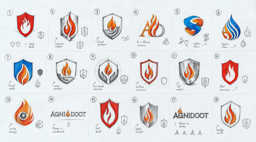
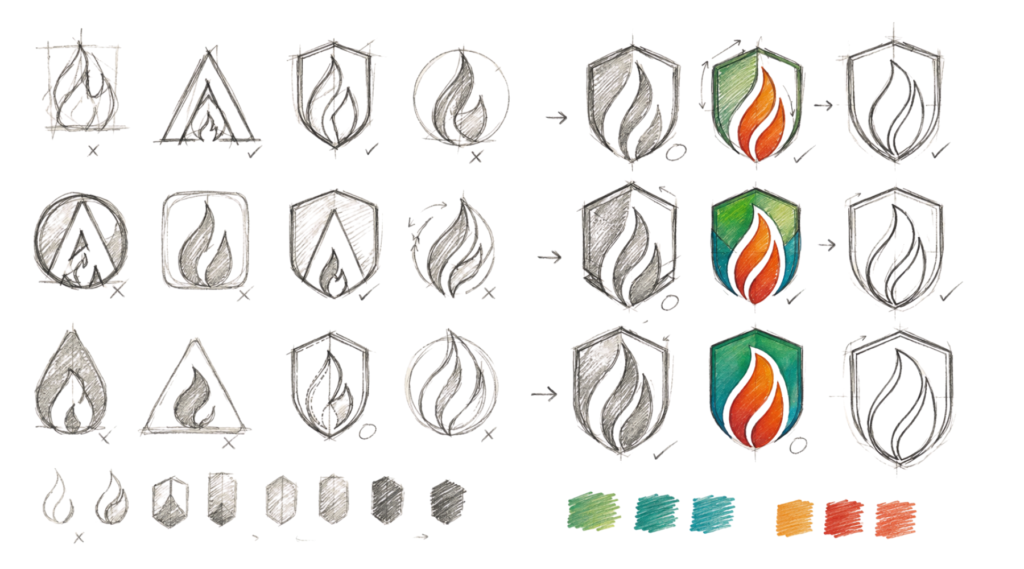
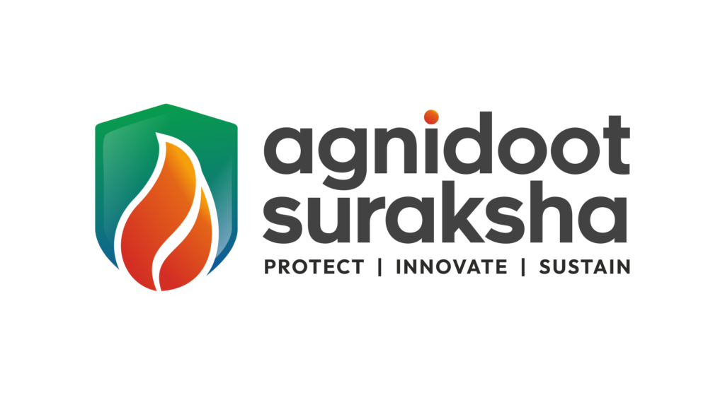
The logo combines two powerful symbols: a shield representing protection and a flame representing fire safety. The bold yet modern form establishes Agnidhoot Suraksha as a dependable safety partner.
The colour palette reinforces the brand’s core values:
Green: Safety, sustainability, and prevention
Blue: Trust, professionalism, and technical expertise
Orange and red: Fire, energy, alertness, and immediate action
The lowercase typography gives the identity a contemporary and approachable character, while the tagline—Protect | Innovate | Sustain—captures the brand’s long-term commitment.
Final Logo
Brochure Design
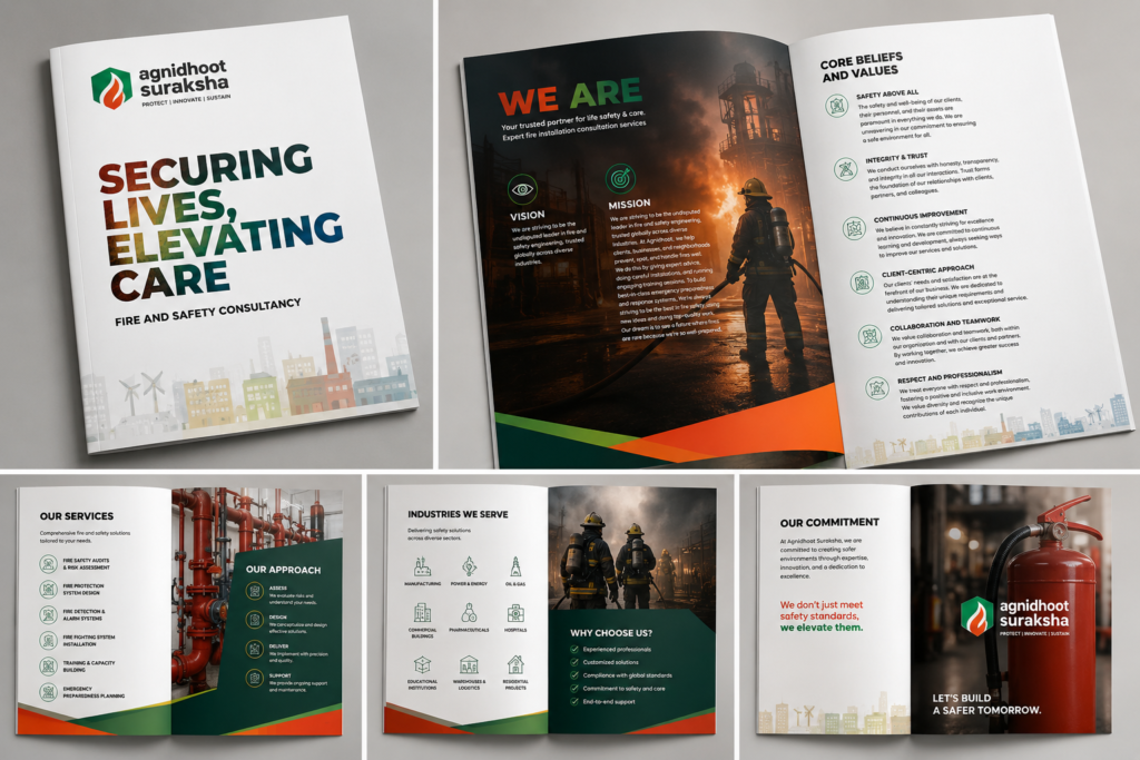
Two detailed 23-page brochures were designed to communicate Agnidhoot Suraksha’s key service verticals:
Fire and Safety Consultancy
Fire Risk Assessment
Fire Protection System Design
Fire Safety Audits
Fire Safety Training
Fire Protection Installations
Environmental, Health and Safety Audits
Safety Culture Assessment and Transformation
The brochures use strong typography, structured layouts, custom icons, industrial photography, and colour-coded sections to simplify complex information. A consistent visual system connects every page while maintaining a clear hierarchy and comfortable reading flow.
Design Approach
The visual direction balances the seriousness of industrial safety with a modern, people-focused presentation. Bold headlines create impact, while clean layouts, process diagrams, service icons, and real workplace imagery build credibility and make technical content more accessible.
The Outcome
The final identity and brochure system give Agnidhoot Suraksha a consistent and professional brand presence. The communication clearly positions the company as a comprehensive partner for fire safety, workplace protection, training, compliance, and sustainable safety practices.
Project Highlight
Transforming complex safety expertise into a clear, credible, and powerful brand experience.